There are moments in ones career when a project crosses the boundaries of standard collaboration. (re)Designing packaging for Pag salt products is one such moment. Giving new clothes and a new visual identity to products that represent the very essence of Croatian traditional production is a special responsibility and satisfaction.
Pag salt packaging redesign
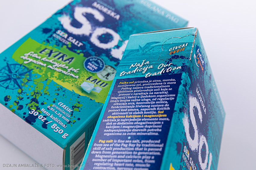
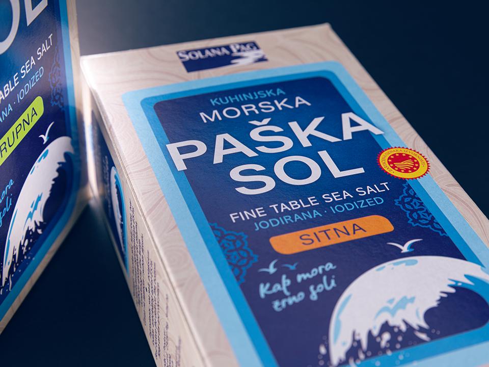
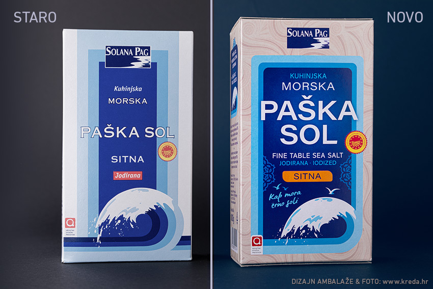
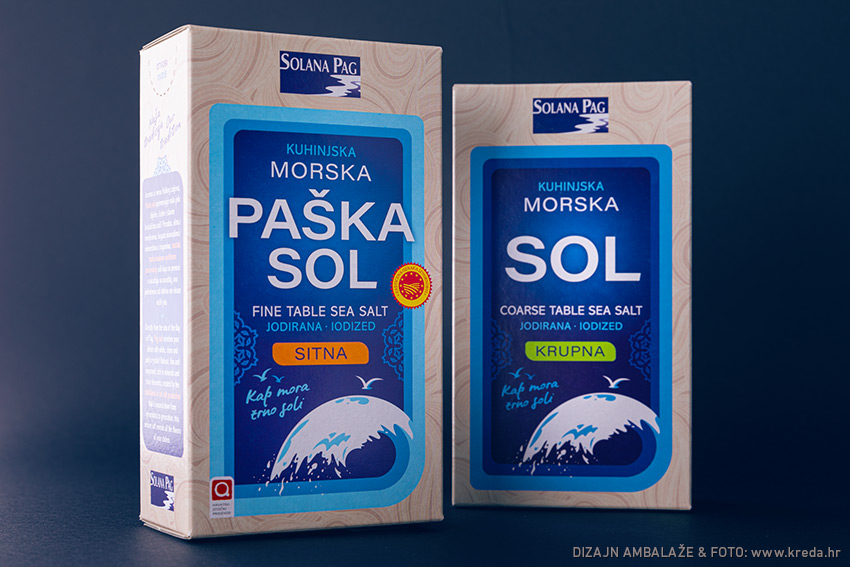
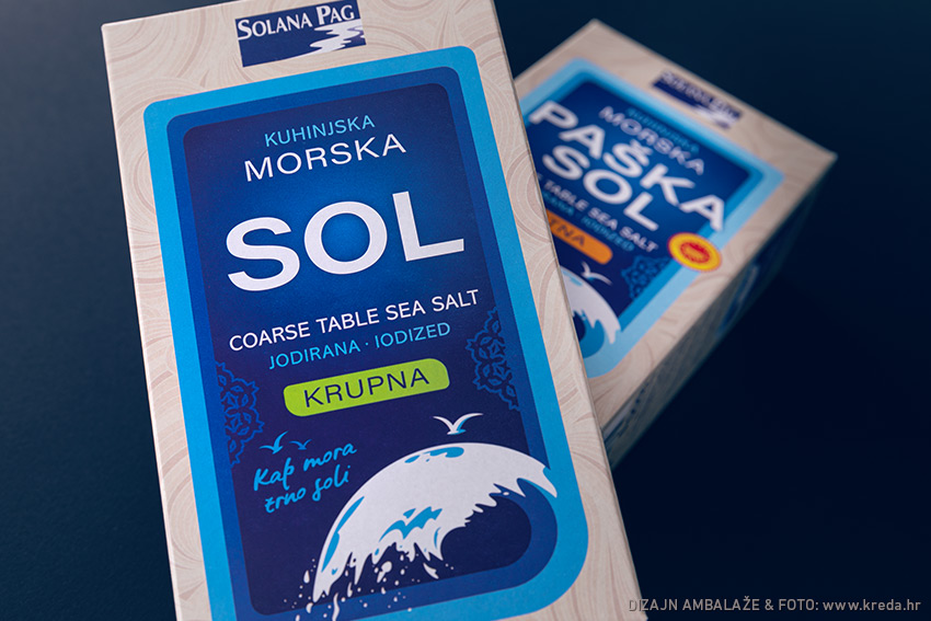
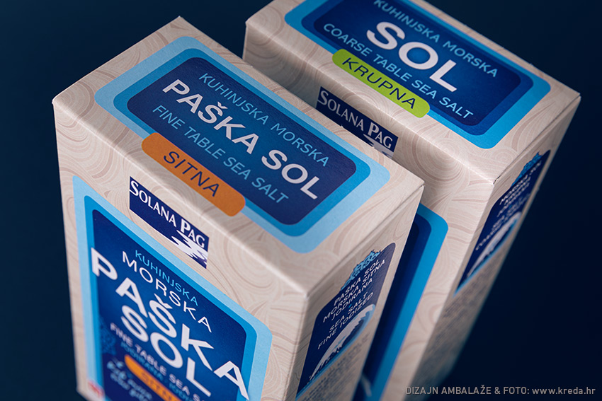
Pag salt is one of the icons of domestic production. Packaging redesign was challenging both from the standpoint of modern visualization quality and from the perspective of maintaining a communication link with a recognizable products that, as such, have been on the shelves for more than 20 years. Have we managed to refresh the product line design (fine and coarse Pag salt) and keep the communication continuity, judge for yourself ...
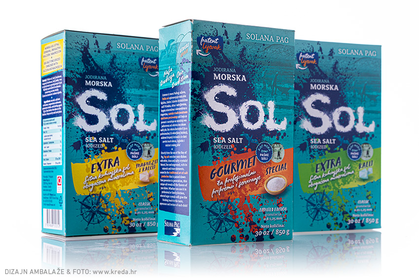
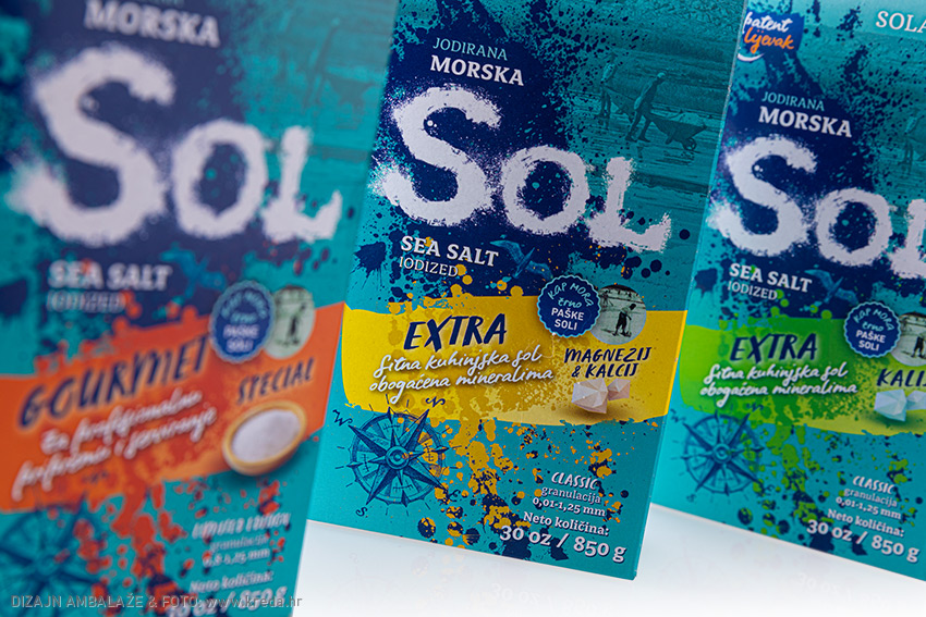
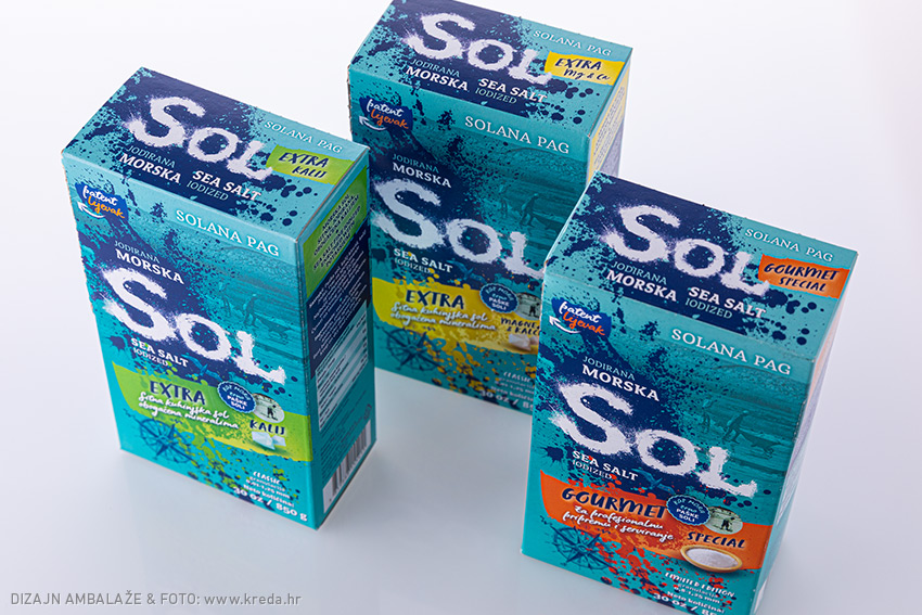
Packaging design for specialized product line of Solana Pag
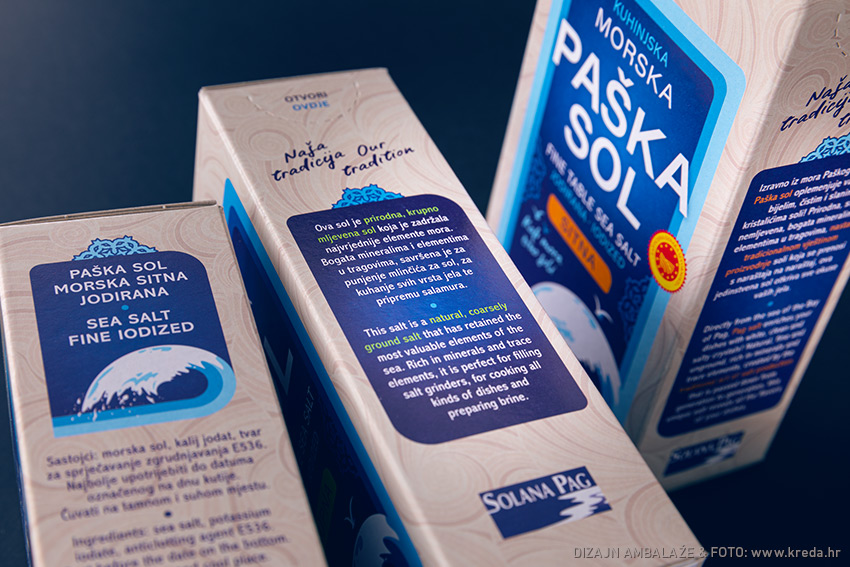
In addition to the standard Pag salt in fine and coarse versions, Solana Pag also has a range of special products enriched with minerals and a Gourmet version of coarse granulation. The completely new packaging design of the product line targets new generations of "home chefs" who consider food as a determinant of their own identity and an essential element of a healthy life. The packaging is designed so that it figures in the kitchen as a contemporary aesthetic element. Island of Pag stylization, a touch of salt sprinkled in the name of the product, elements of the coastal homeland landscape, original old photographs of work in the saltworks and strong color scheme - are connected in attractive, somewhat artistic visuals.