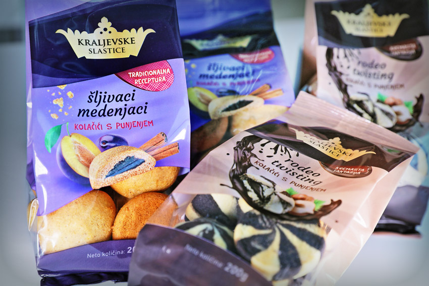
Kraljevske slastice trade mark owners decided to make a change in the presentation of their own products, which includes logo redesign, branding of food products series and the new packaging design.
Product line branding with logo redesign
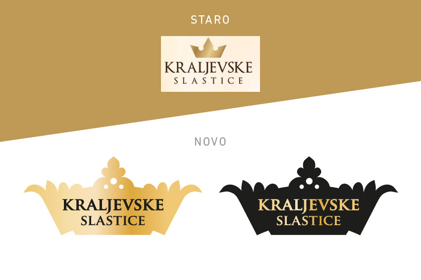
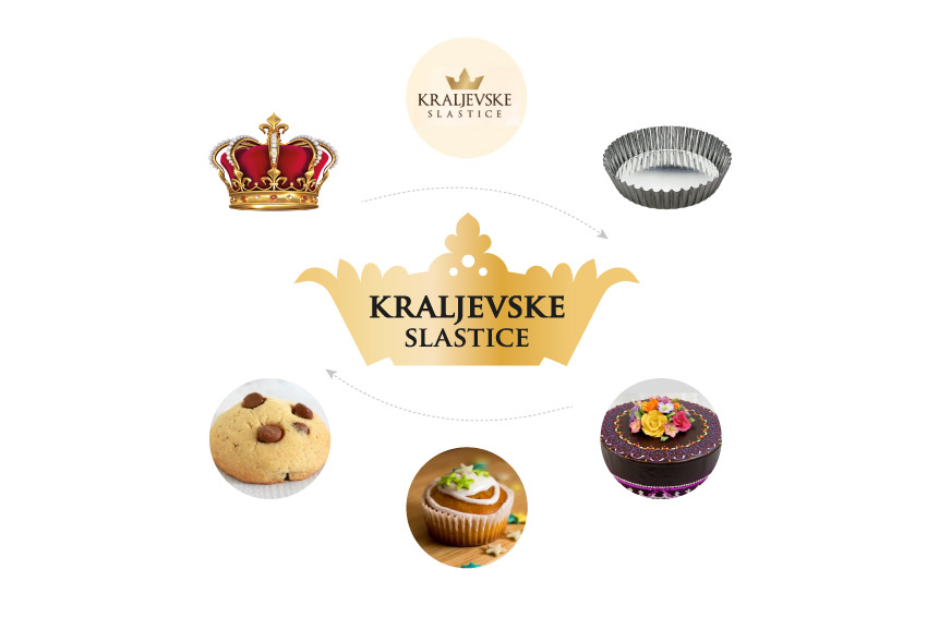
Our task was to design a fine transition from the old brand visual identity to a new, more quality and aesthetically elaborated form that would better match the product development vision and to interest customers to think about the quality of the assortment offered. Kraljevske slastice logo design relies on existing visual identity through the form of the crown and style of typography as a continuity element.
To hold on basic idea within the new style of packaging design
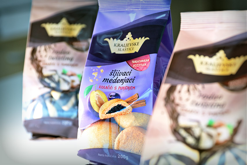
The basic idea of "royal identity" is continued through a modified graphic element of a crown that, besides the basic jewelry style, carries the symbol of cookie decorations and the shape of a mold used to bake various sweets - cakes, muffins, buiscits etc. This mold form for sweets, with its branded name "Royal Sweets", acts as a firm and clear brand symbol during forming period of a customers consciousness about the existence of brands and products. The style of performance and colors work as a compact and easy to read whole that ensures visibility, recognizability and effective application across a variety of product types.
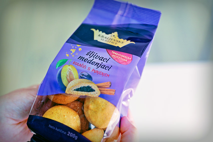
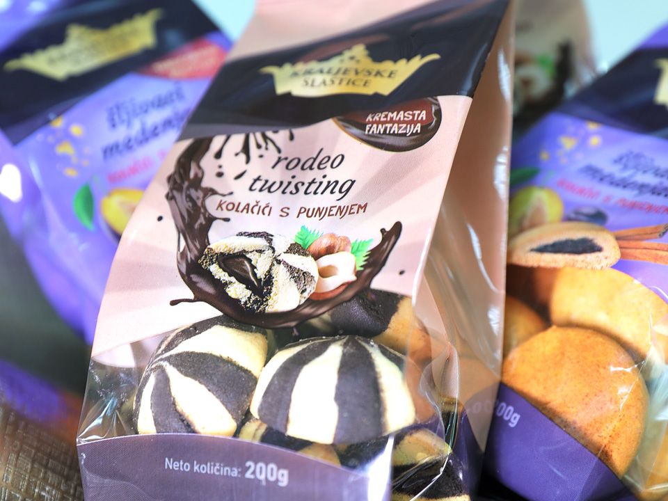
Product photo for packaging design
Product line packaging design includes a product name devising and the original photo of product (biscuits) that is incorporated into the graphic solution.