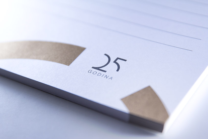
Osatina company is one of the leading Croatian companies in vegetable and fruit production and all related farming and agricultural products. We continued cooperation on branding and packaging design for their brand Vego with logo redesign and branding due to 25th anniversary of the company's existence.
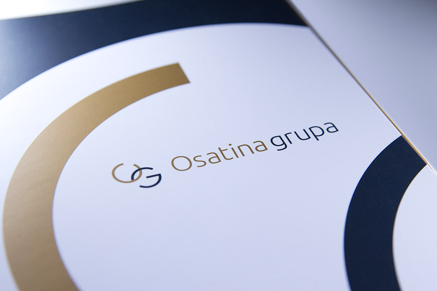
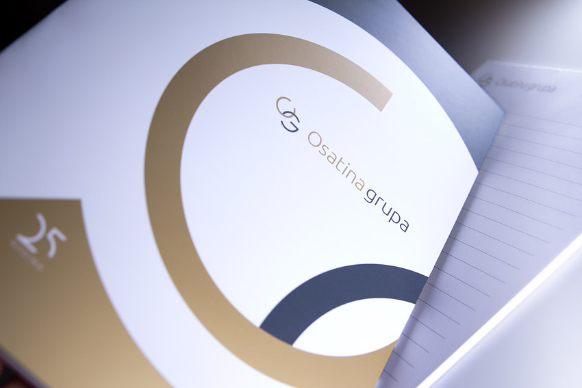
Logo symbol is originated form "O" and "G" characters shapes, which act as a stylistic initials of a company name. Presented by a thin and elegant curved line, the symbol primarily communicates with reliability, dynamics, high quality and precision. Except being the basic element of initials, the circle is a link element between interwoven and complementary business processes into complete whole. Openings in circles are a detail that talks about the open approach to new solutions, innovations, and progress by acting out of usual frames.
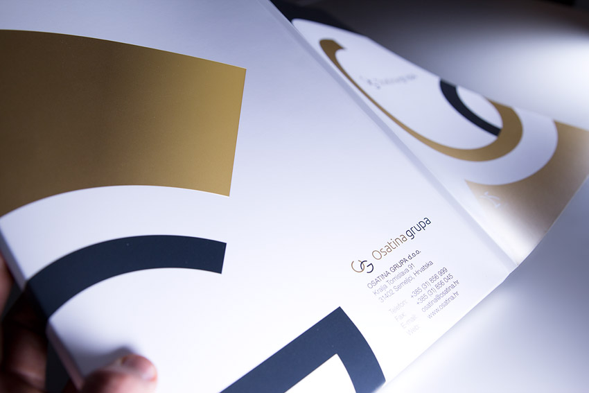
We reproduced brand identity through corporate materials design - folder design (business folders), memos, business cards, new year calendar design etc.