Due to 50 years of existence of Helvetica, as one of the most widely used types of fonts in the world, we created two graphic design solutions for posters for the contest "50 Years of Helvetica in Croatia".
The task was to formulate own visual expression of arbitrary message by using typographic elements and elements that bring Helvetica and Croatia in a specific relationship.
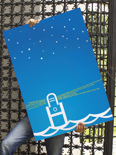
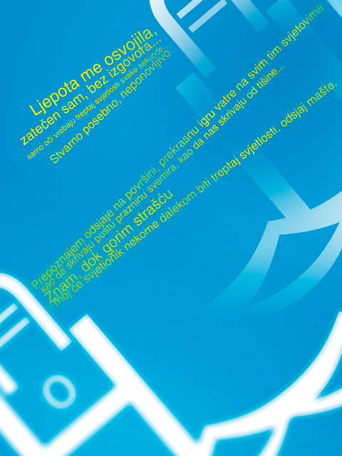
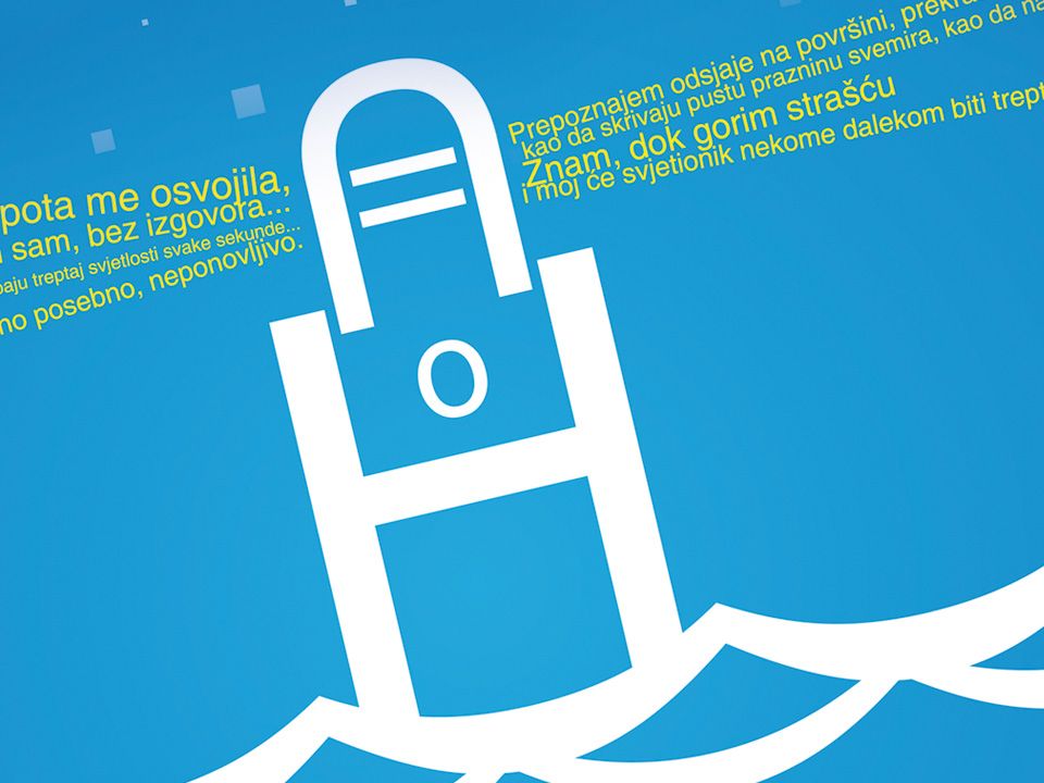
First solution was conceived as a landscape image of the sea and lighthouses communicating the concepts of Croatian natural and historical heritage. The symbolism of light spreading from the lighthouse is brought into the metaphorical relationship with the messages that are printed as a graphical expression of the light rays. With original messages, we deliberate freedom of creative thinking.
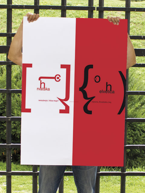
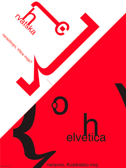
Second solution visualizes two graphical elements that are constructed of two types of brackets: square and curved. The aim was to achieve the personification of Helvetica as a creative "living" element and present it in a dynamic relationship with everyday communication needs. Typographic stylization of the heads in the form of squares that exchange messages, are metaphors of Croatia and Helvetica, i.e. of ourselves and and the unavoidable communication media.
The solutions were awarded in the selection of 12 best works.